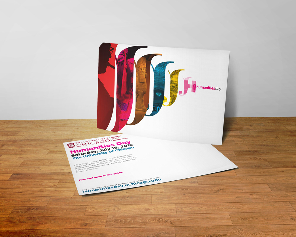
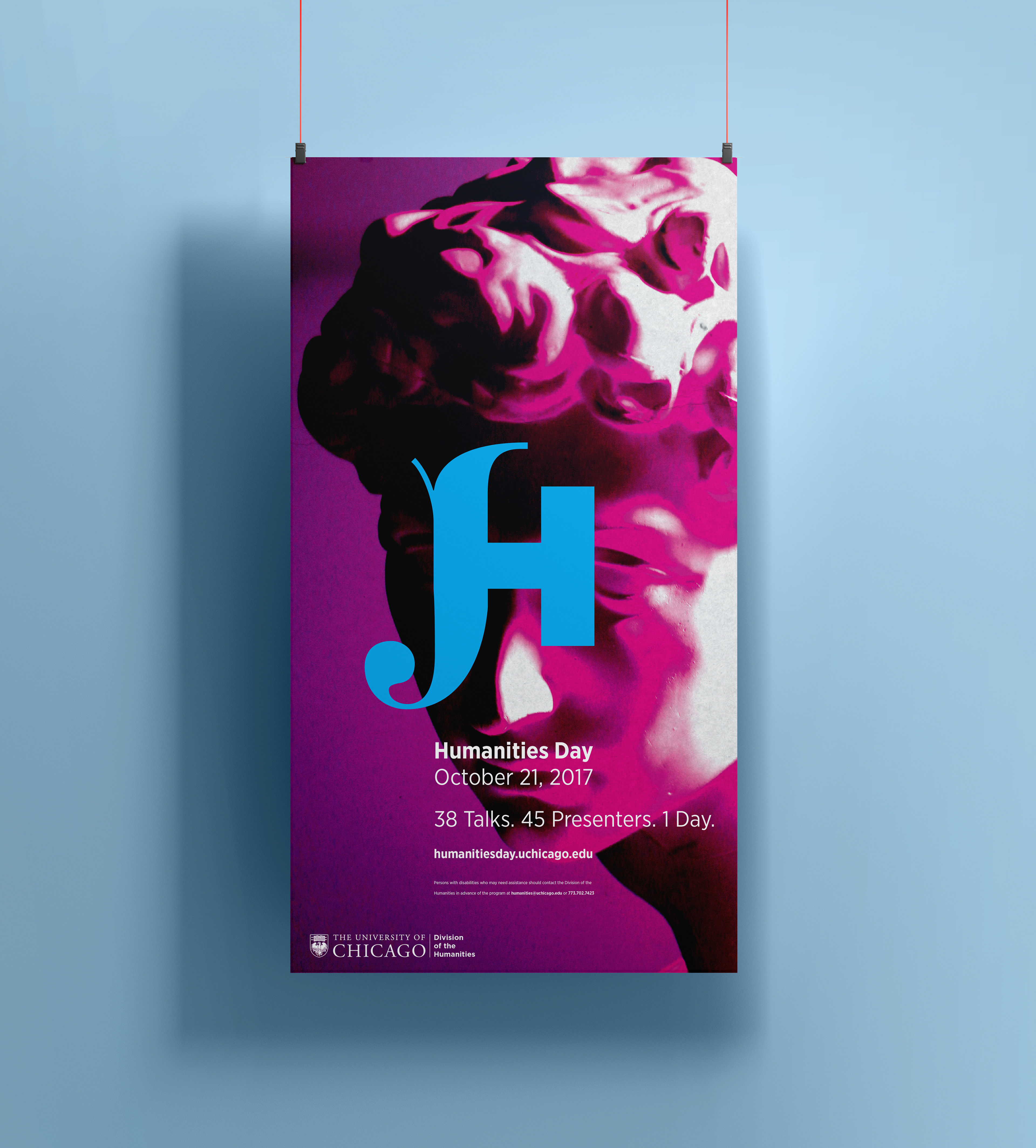
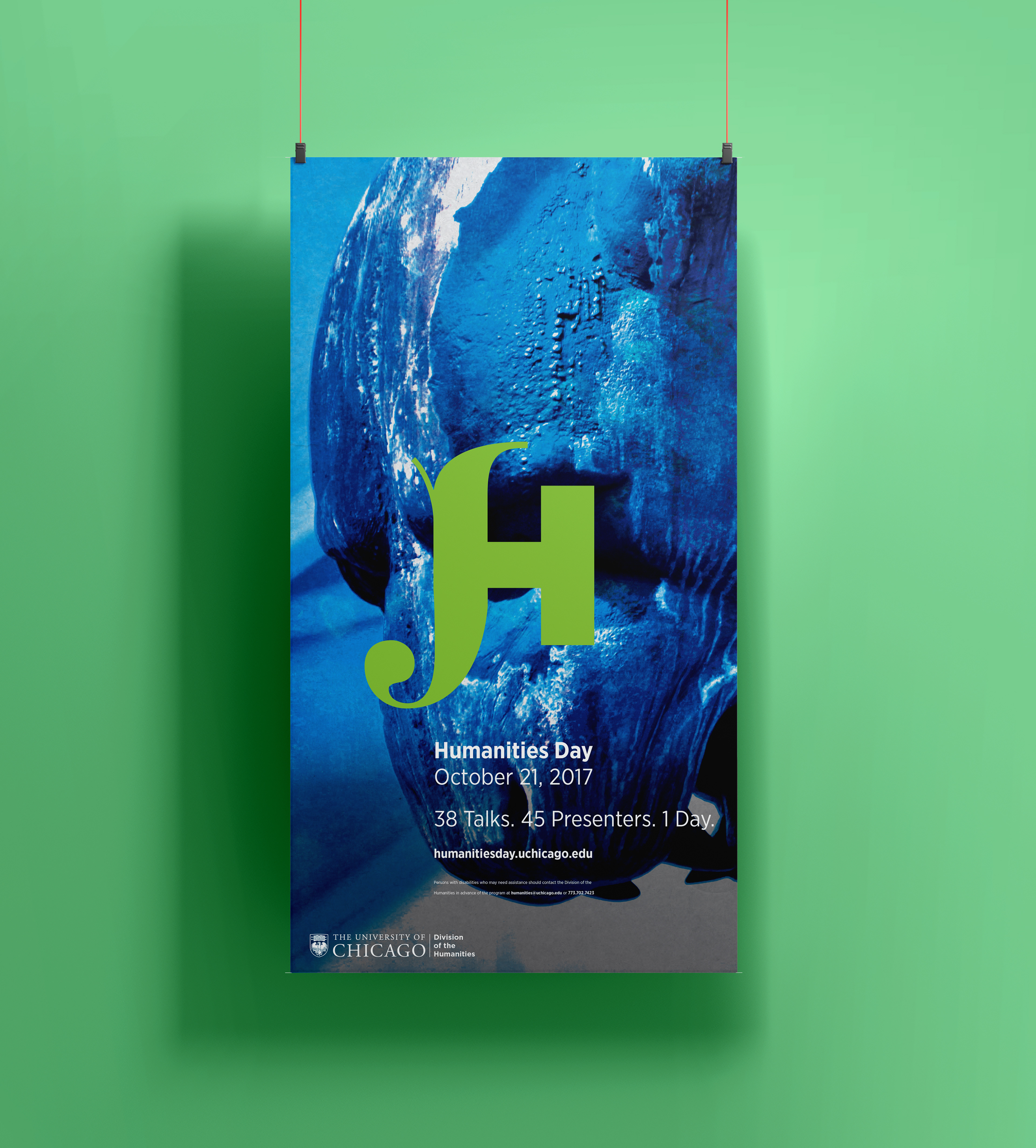
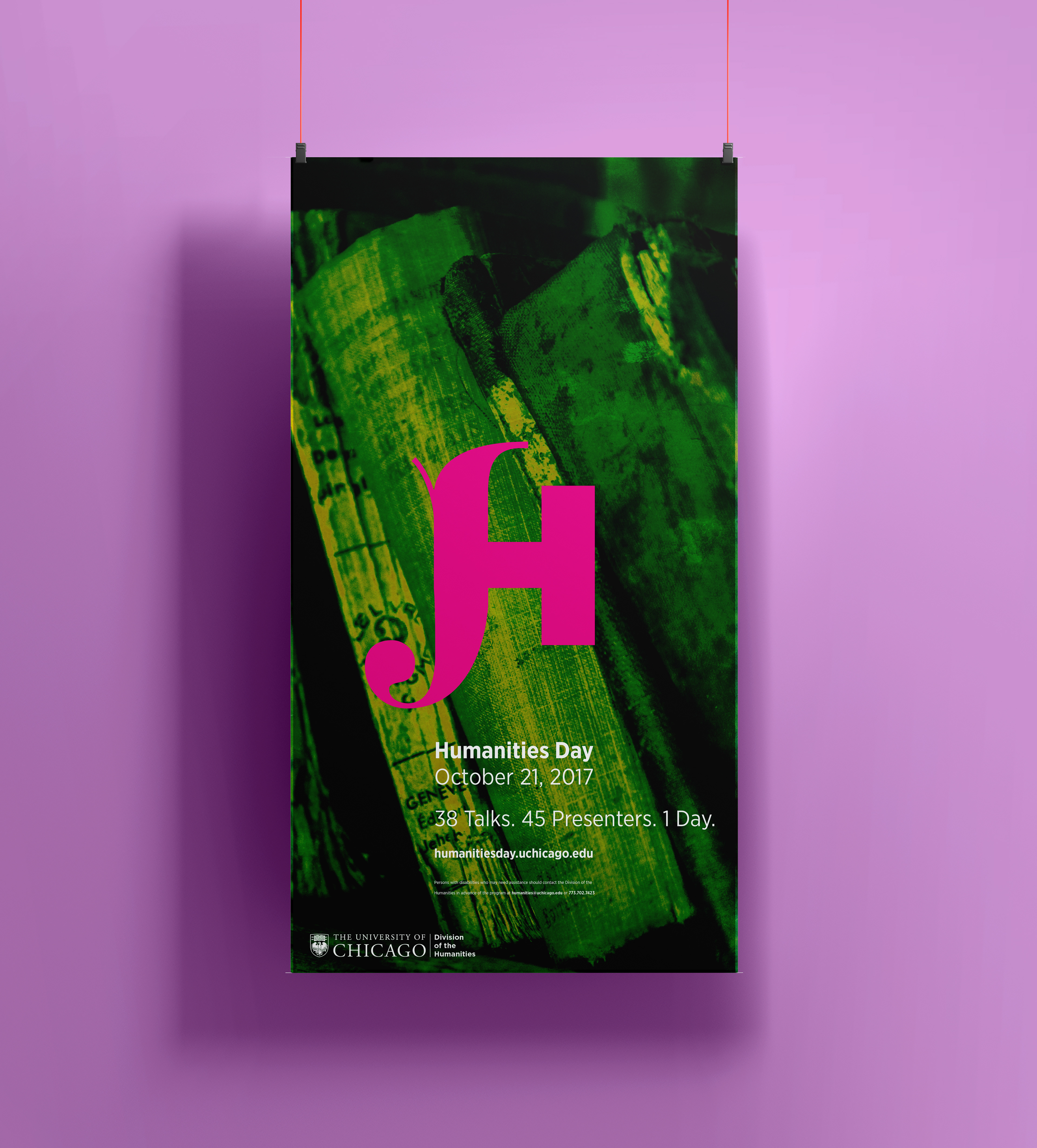
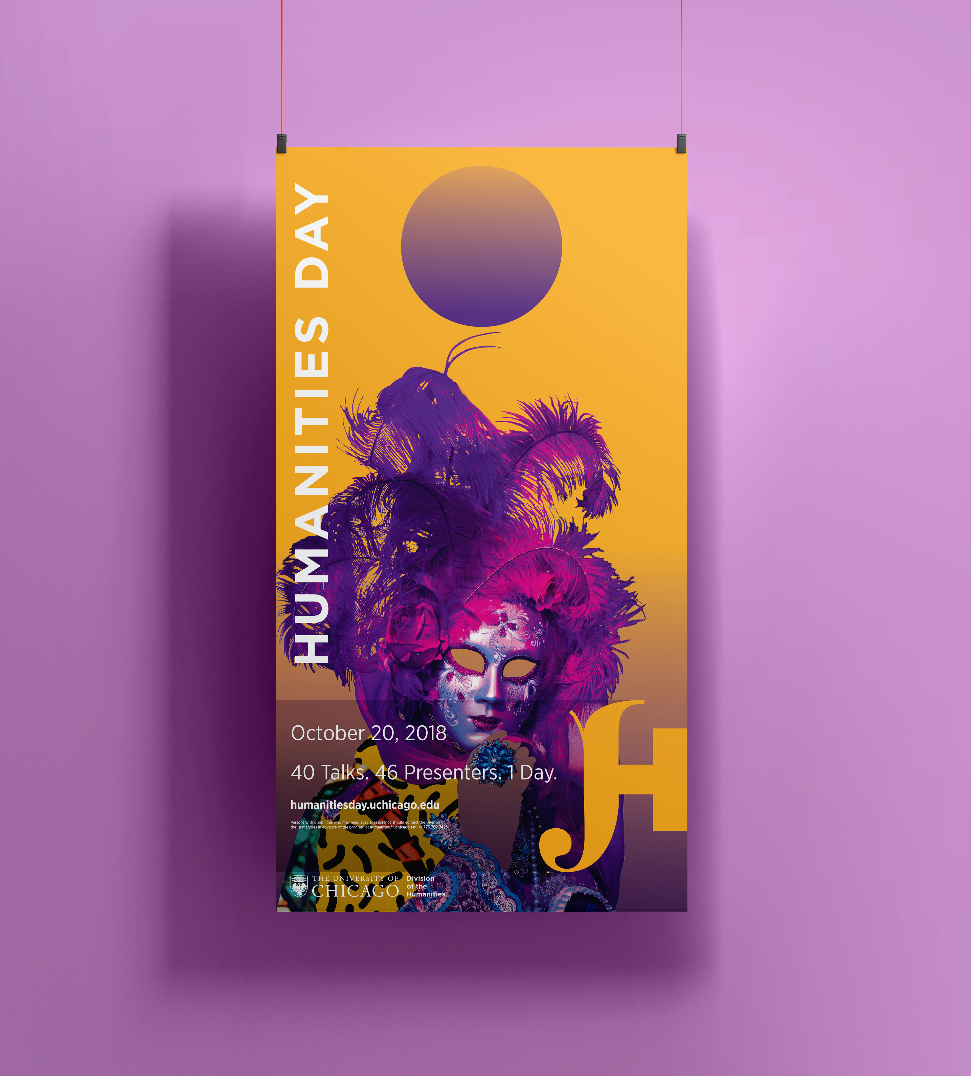
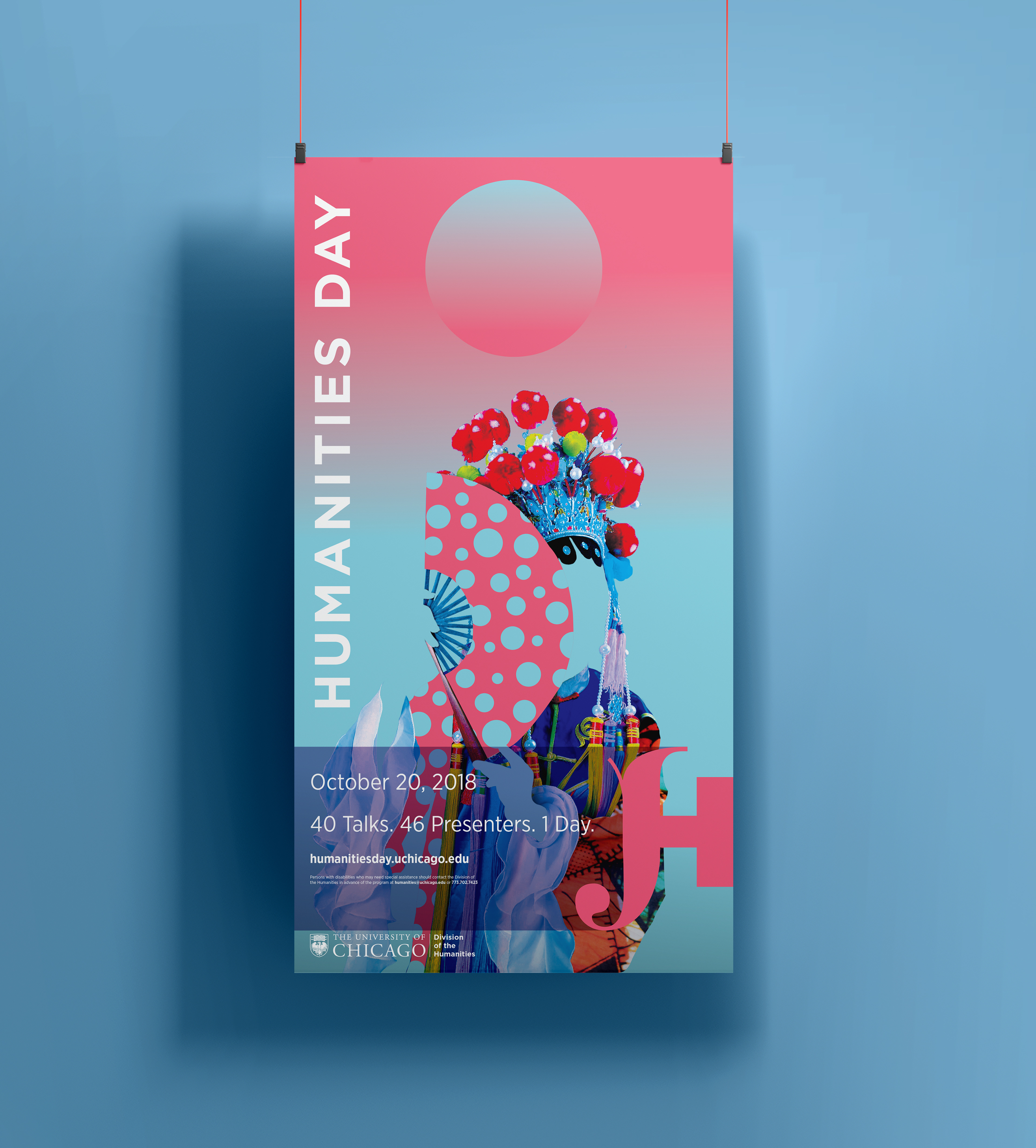
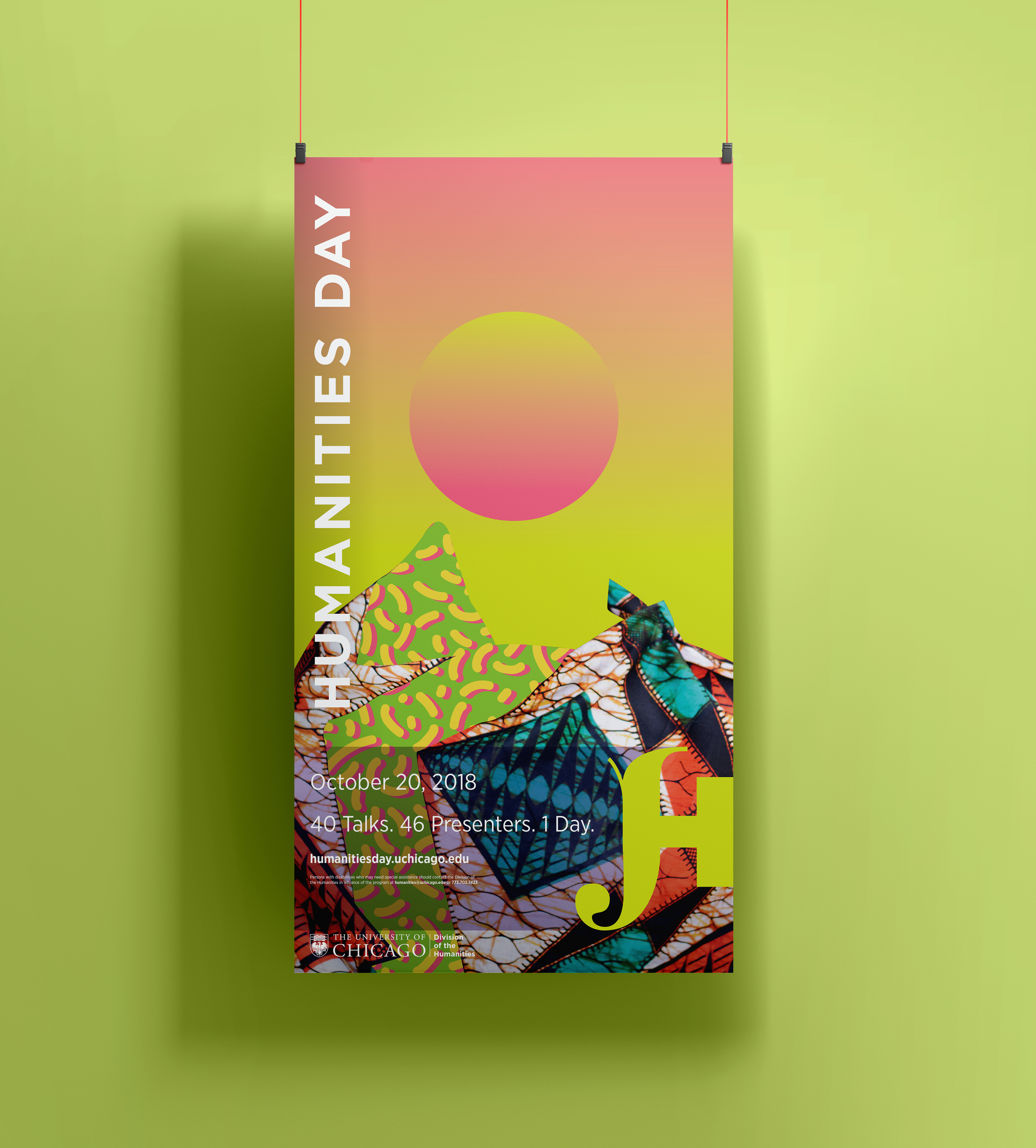
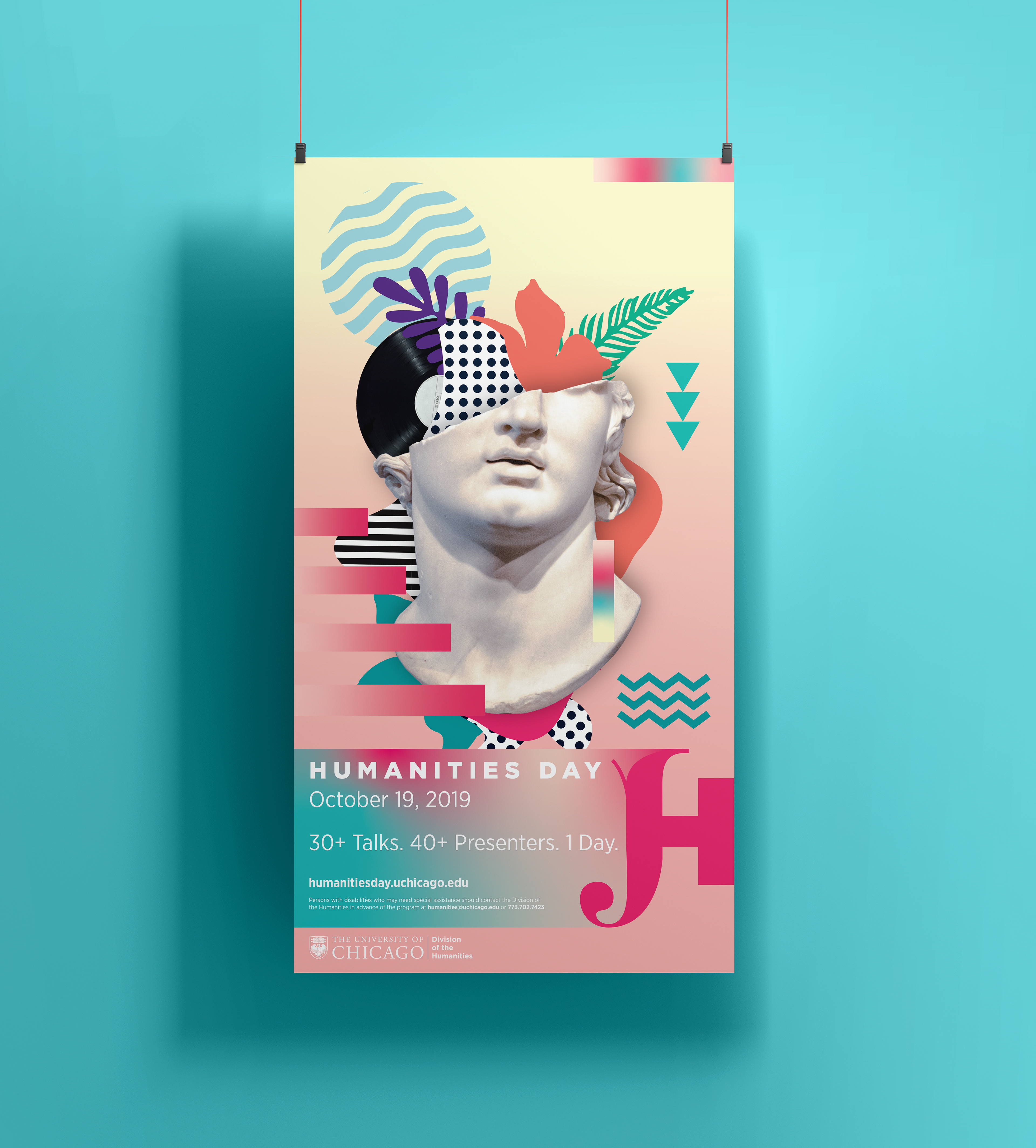
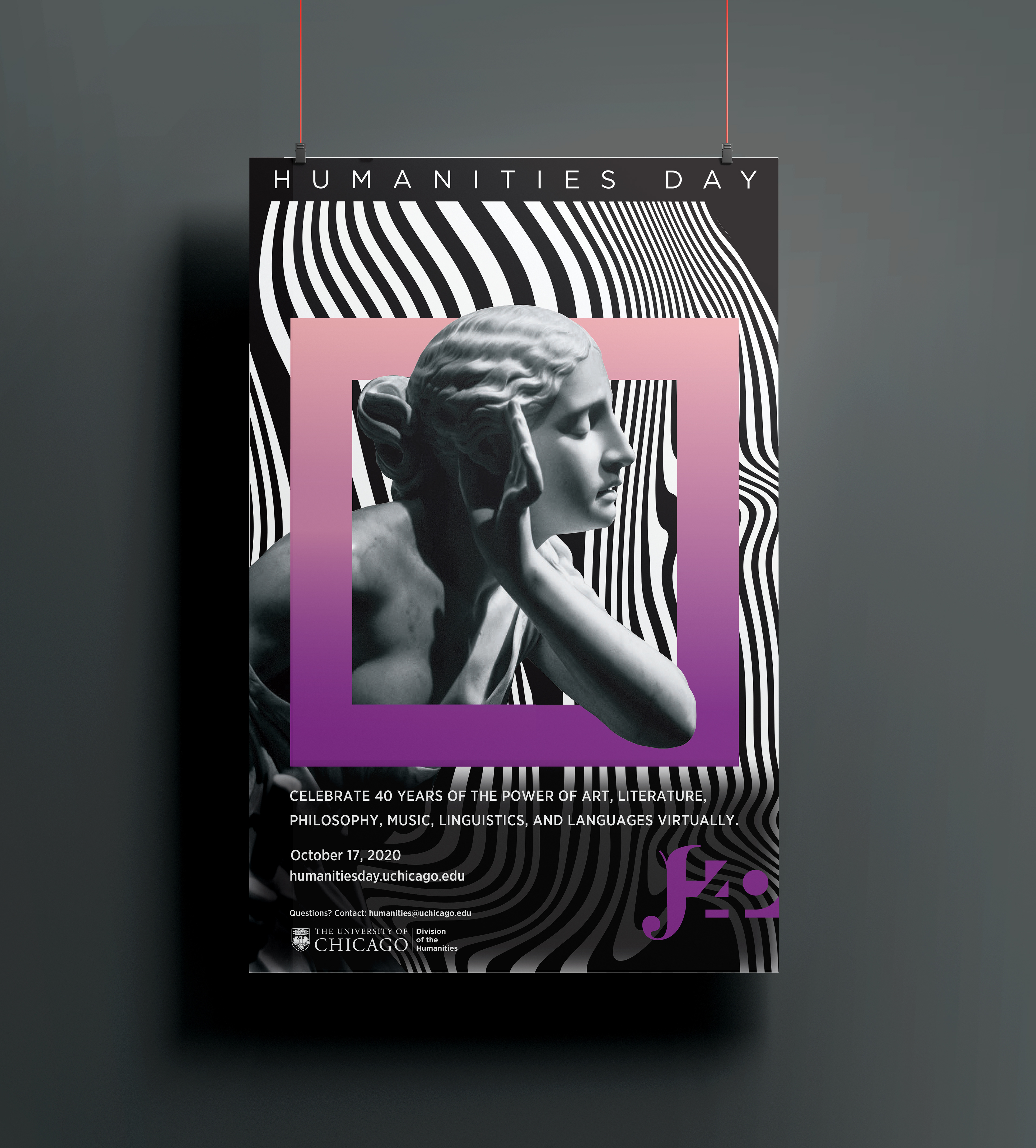
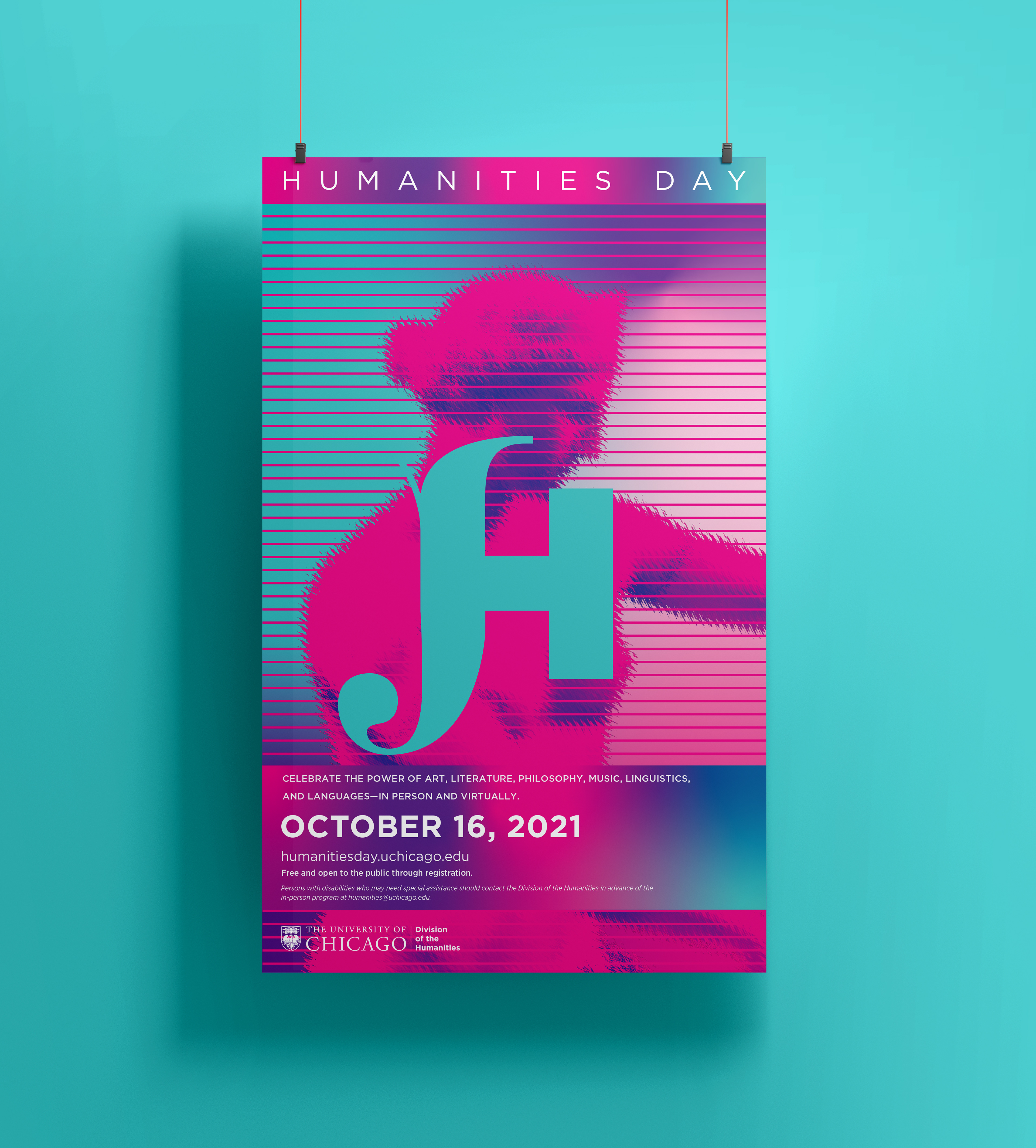
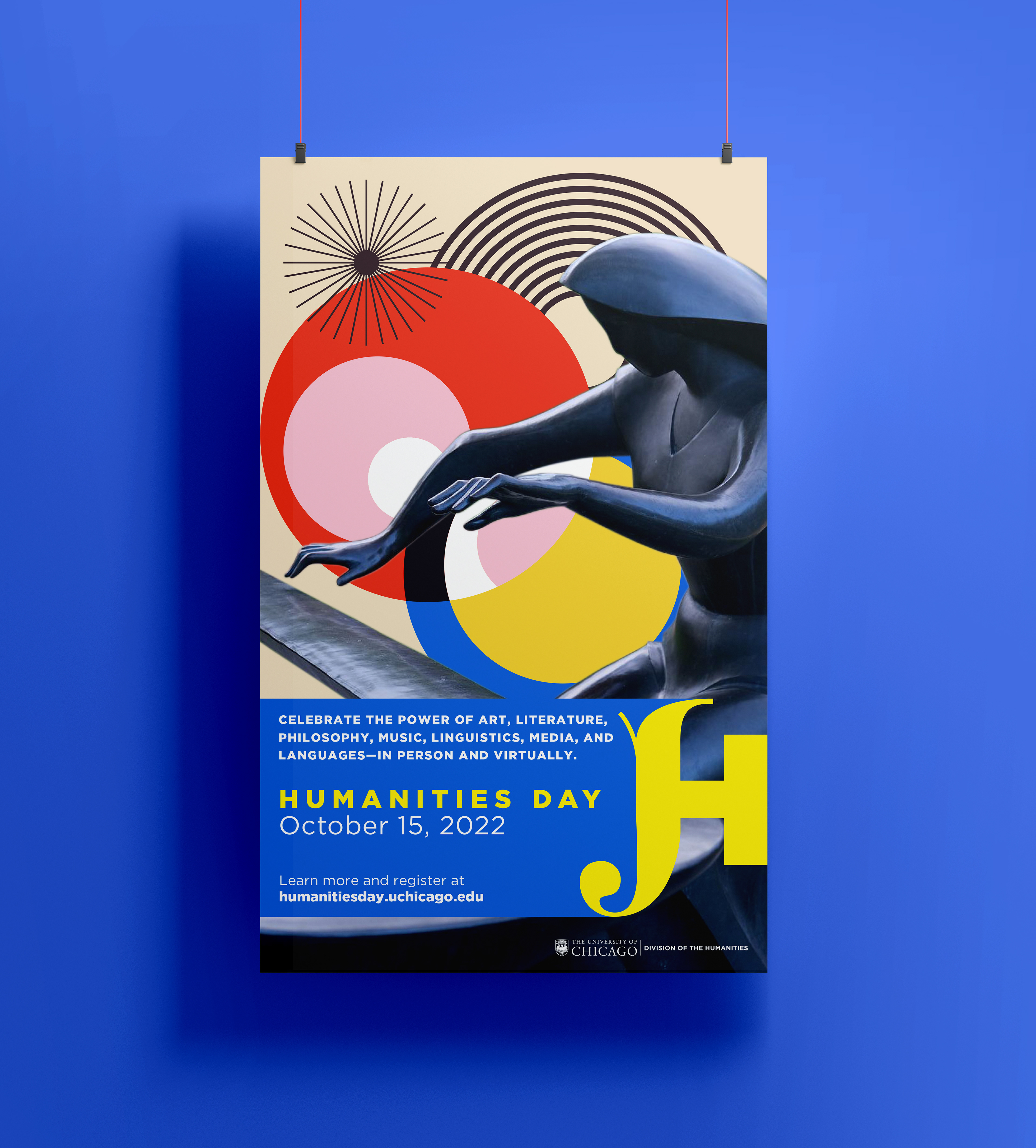
Logo and visual identity for Humanities Day at The University of Chicago.
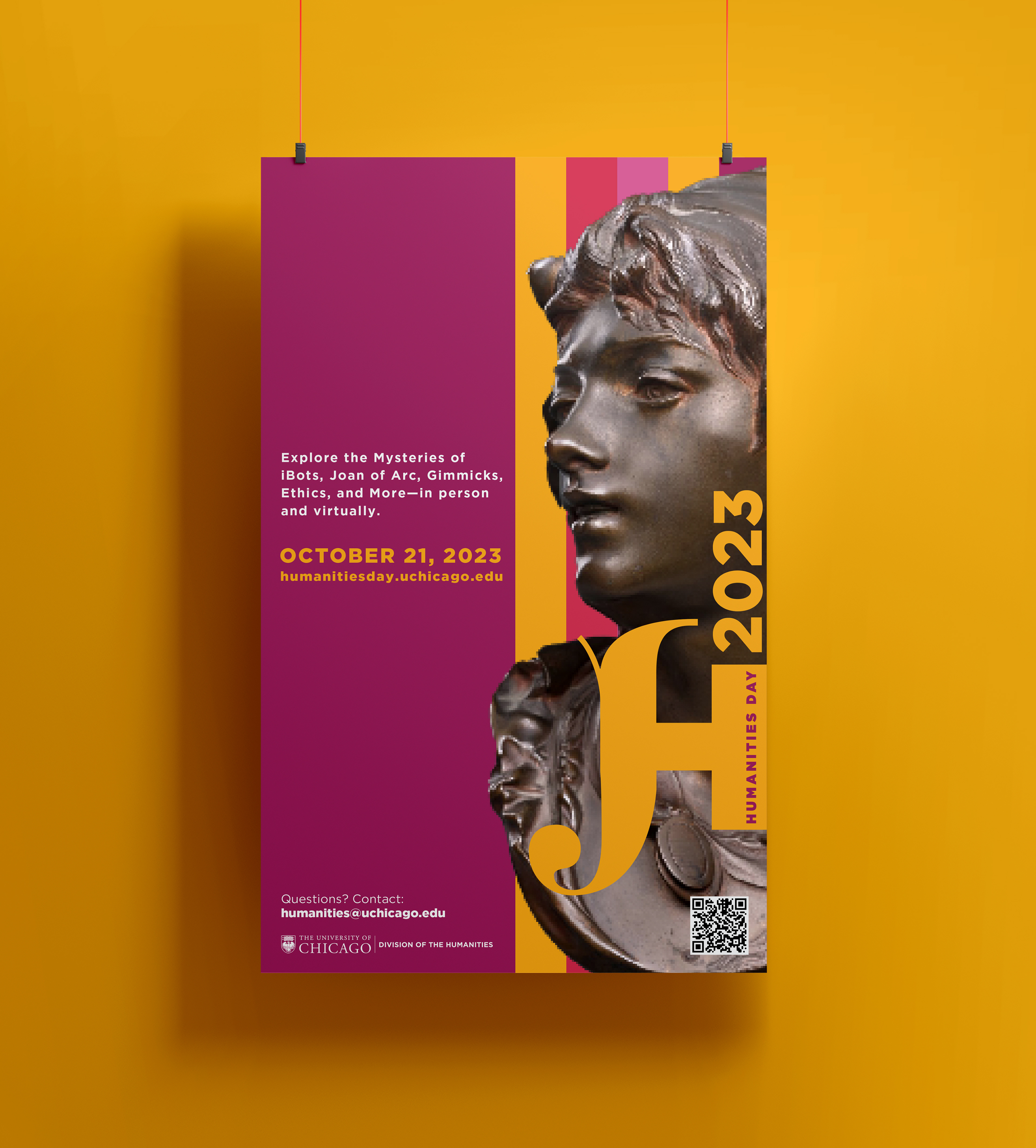
An annual October tradition since 1980, Arts and Humanities Day invites the intellectually curious into the distinctive spaces at the University of Chicago to experience performances, discussions, and tours from the award-winning faculty of the Division of the Arts & Humanities.
Dozens of presentations that represent many of the academic departments of the Division of the Arts & Humanities are scheduled through out the day.

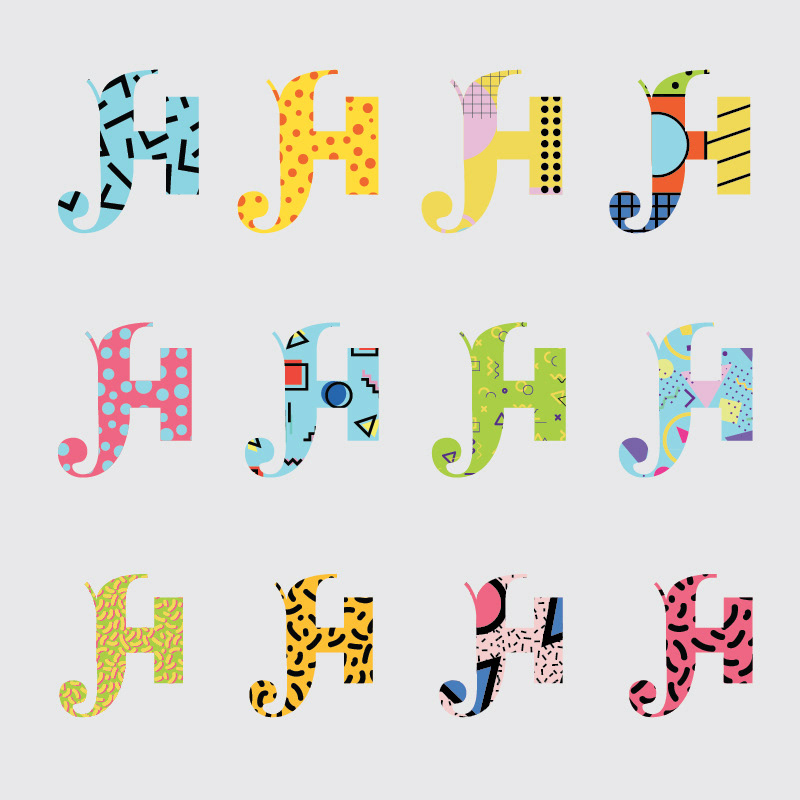
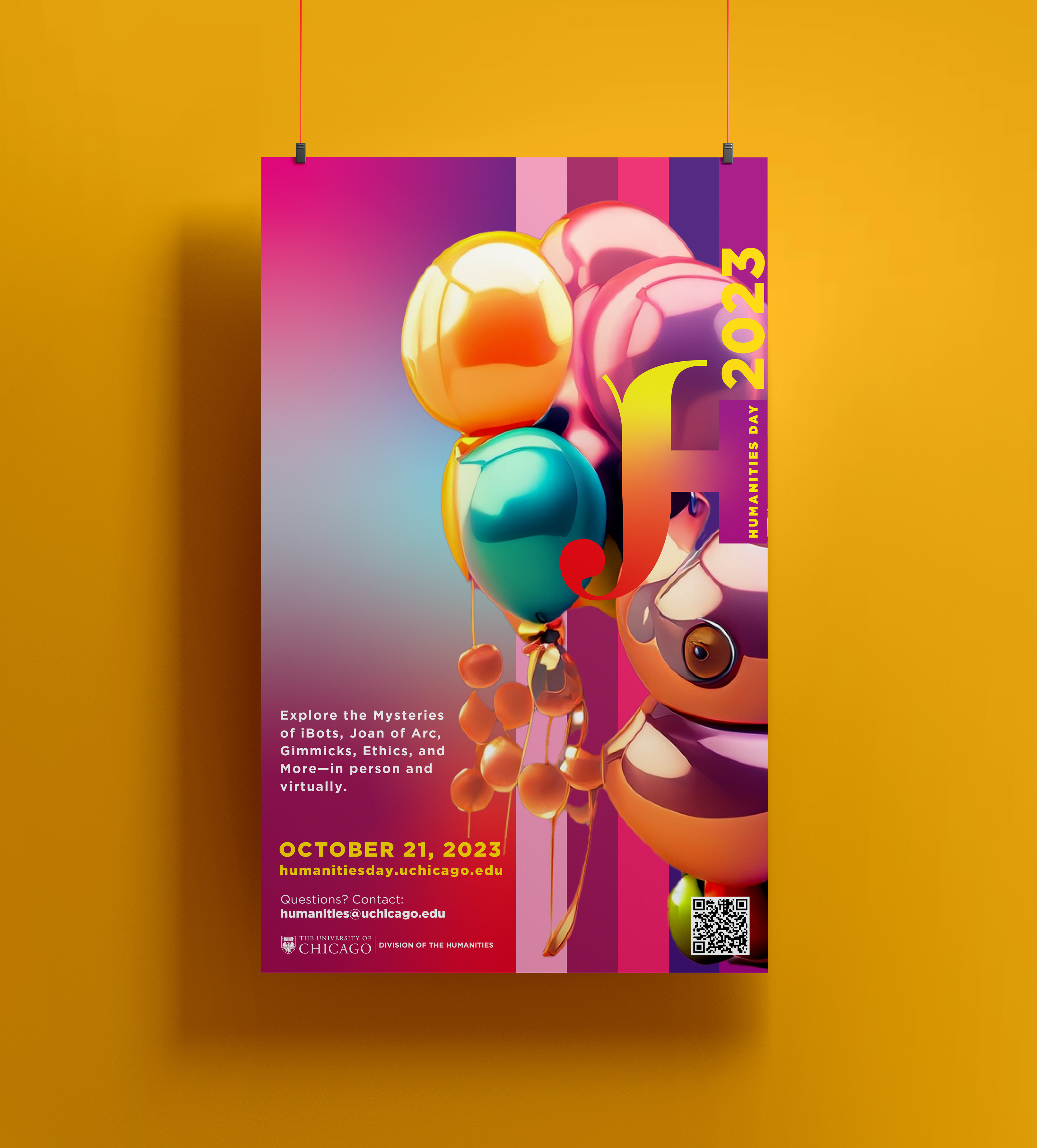
The humanities are significant because they explore human culture and society, providing historical context for the present and fostering crucial skills like critical thinking, empathy, and communication. They have evolved from ancient disciplines to now include new methodologies, and as such we wanted to create a mark that is reflective of this evolution.
A solution to this came to mind when examining the typefaces that are part of the UChicago brand, starting with Fette Fraktur, an 1800s font that is reflective of UChicago's gothic architecture. The lowercase 'h' had been previously used as a mark by the Division of Humanities, and we juxtaposed this with Gotham, a modern typeface that is also part of the UChicago brand.
My goal was to find a way to merge these into a new letter 'H' as means to create a bridge from the past to the present while also adding a decorative, human touch to it in the form of the tail, and after many painstaking attempts and revisions we landed on the final H-Day mark.